The design was to imitate A comic book style to give the product a nice pop. one of my main jobs was to help find a good layout style between Print and digital assets as well as developing Headline styles that benefit from vertical and horizontal layouts.

Hex Bin View 1
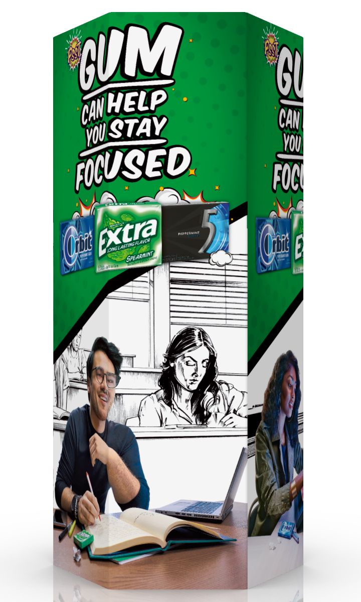
Hex Bin View 2
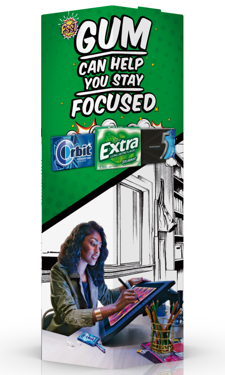
Hex Bin View 3

Counter Unit
The Project also included a Sweepstakes promotion, in which participants could win a $25 gift card. From there it was my job to produce layouts for the Microsite for participants to fill out and notify them of their success in the the sweepstakes. All art was Based on the Key Visual which I had to adjust the headline slightly to fit the smaller layout.
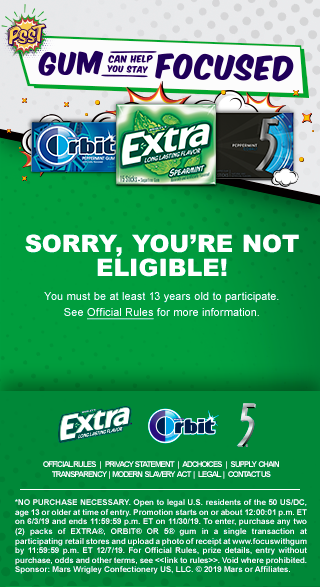
Not Eligible

Age Gate

Loser Page
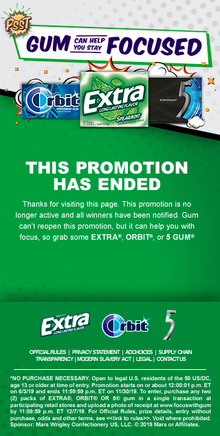
Sweeps Has Ended

Entry

Successful Entry

WINNER!
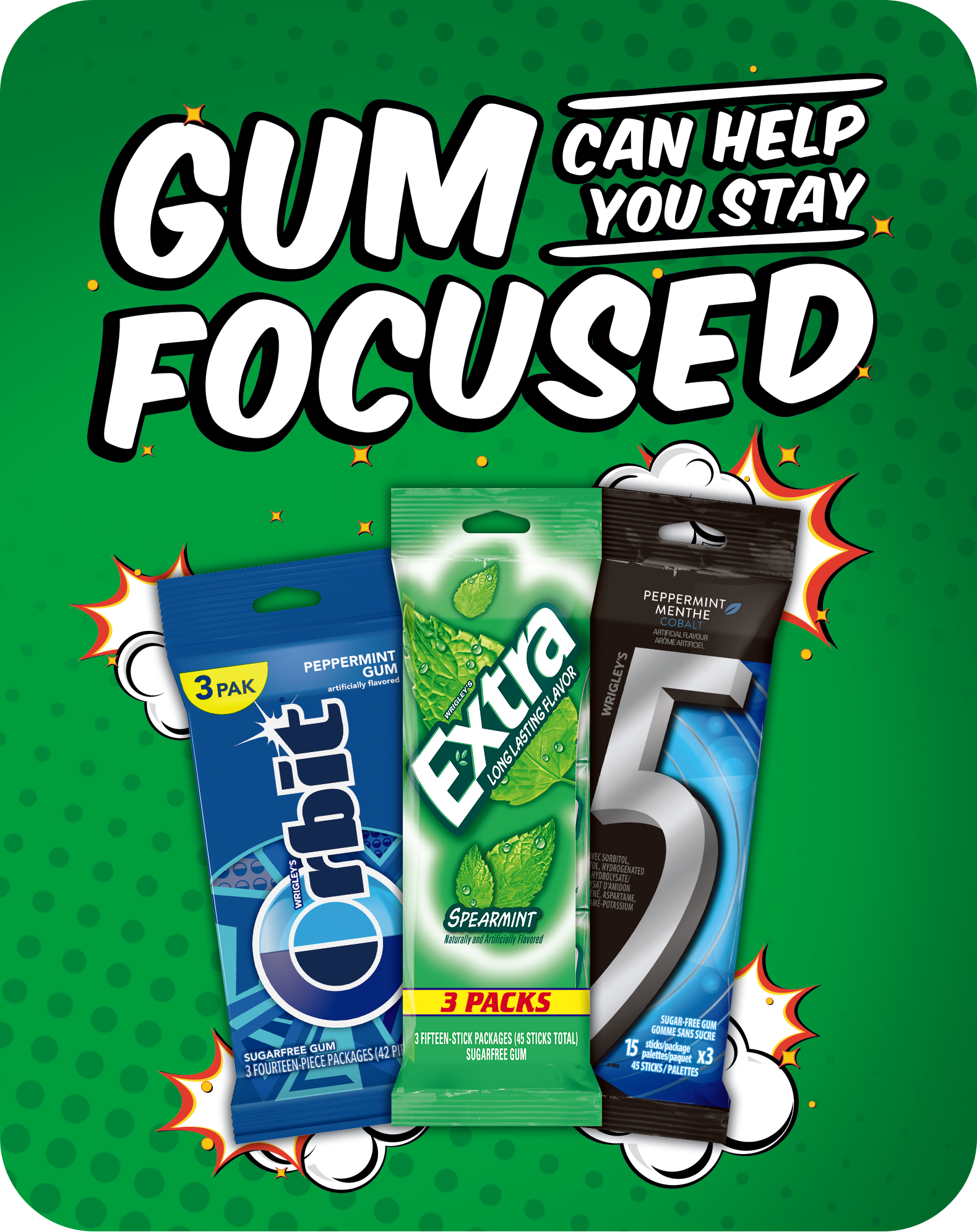
A store "Shelf Talker" to be placed next to products on store shelves
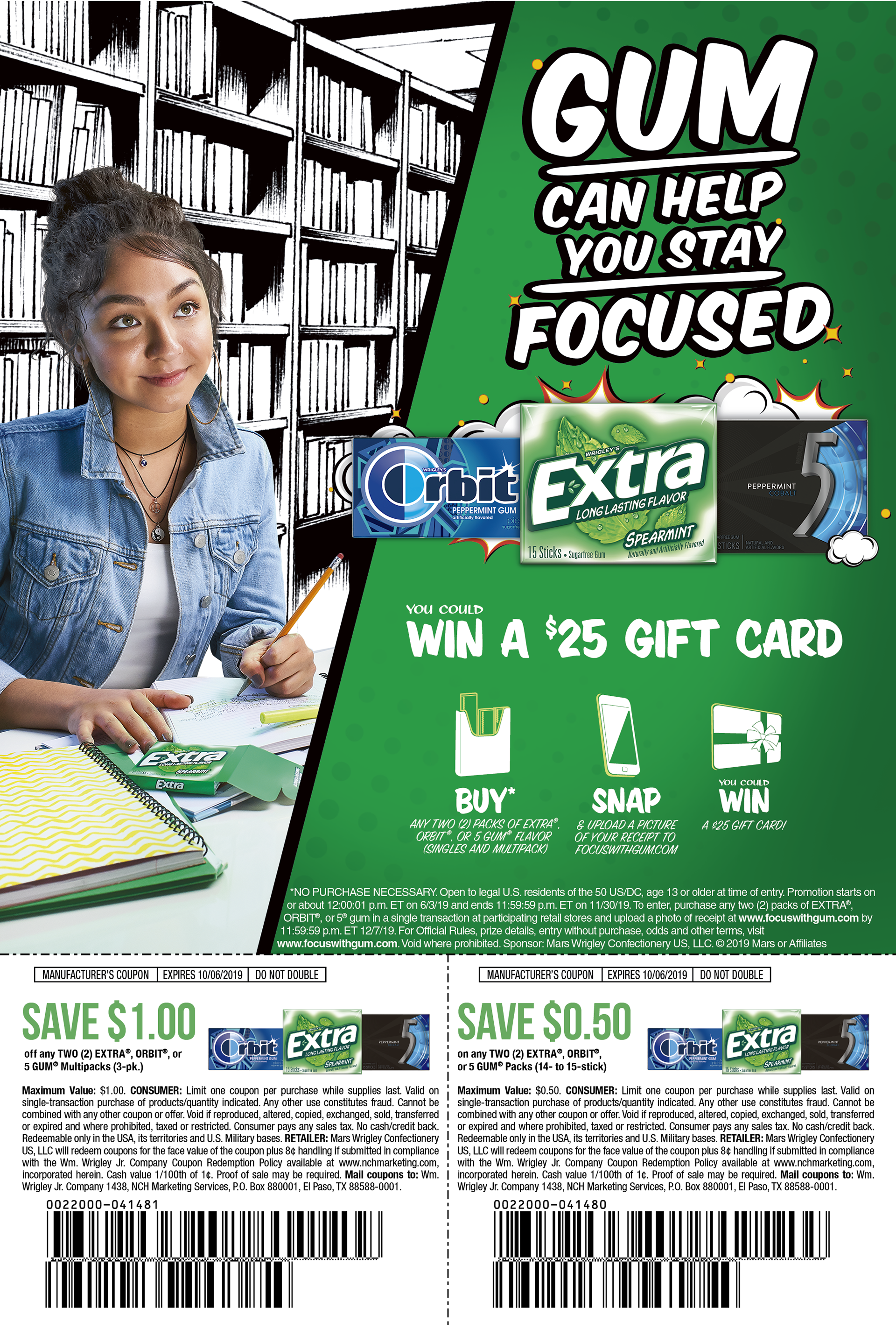
Design 1 for a coupon ad


