This is a culmination of work I created while working for Four Winds Interactive as a Solutions Design Intern. My job consisted of increasing the visual appeal of business proposals and presentations while keeping it within the brand guidelines. Below are projects that I completed while I was there. Due to some legal issues I did have to replace any information with Lorem Ipsum and remove an branding other than color scheme.
For those that don't know, Four Winds Interactive is a digital display company. They develop the software and systems to create digital signage of all kinds of clients.
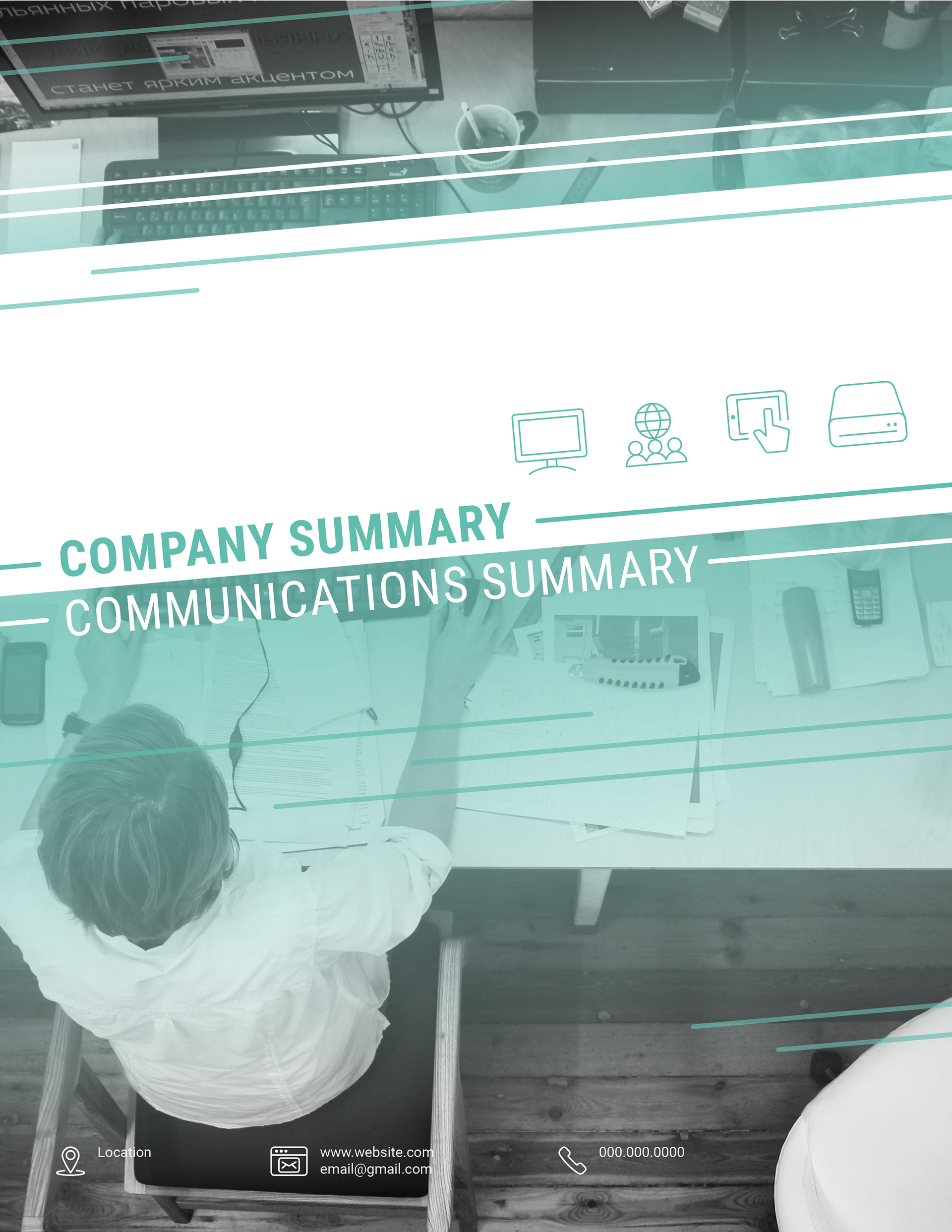
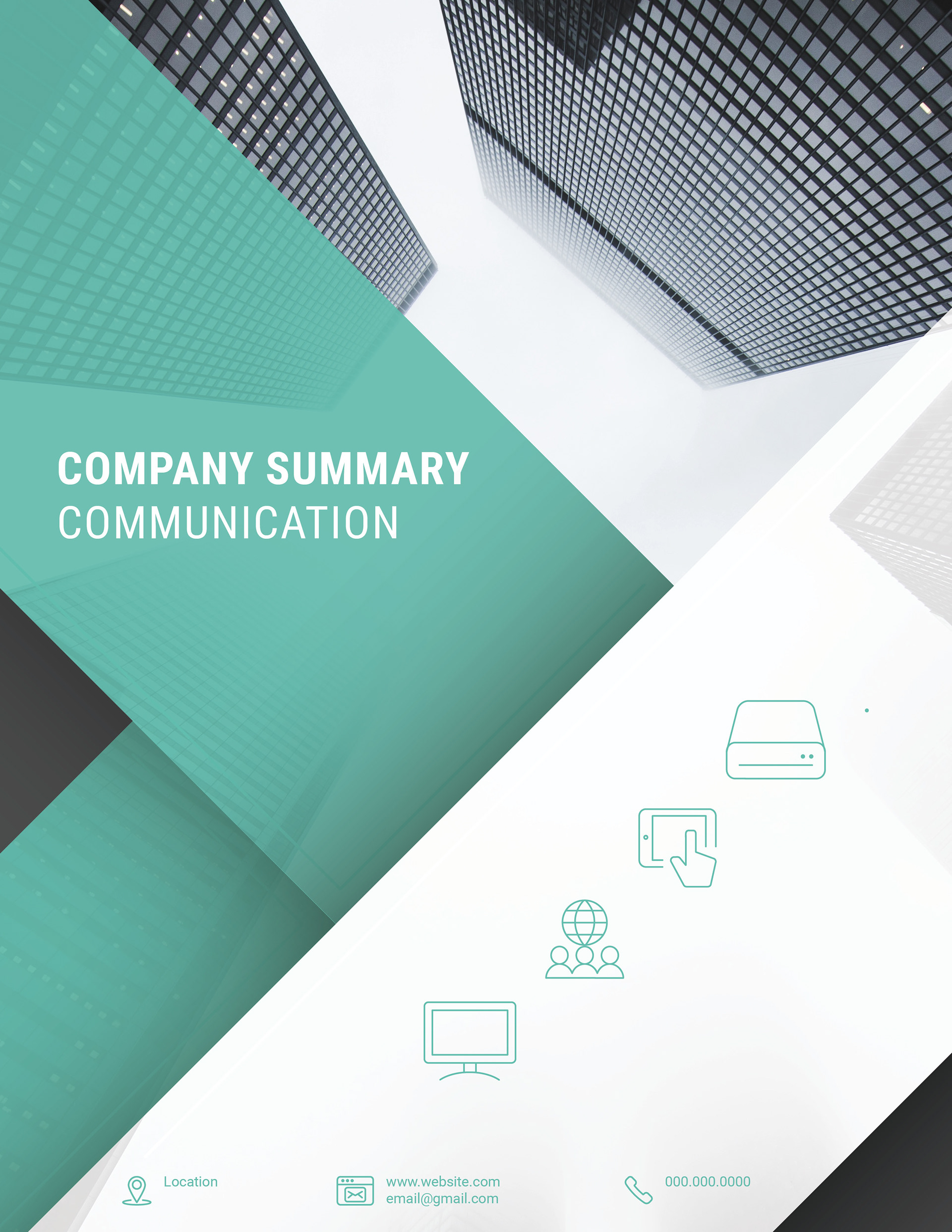
This was a cover design I created on a document that helps relay the company strategy
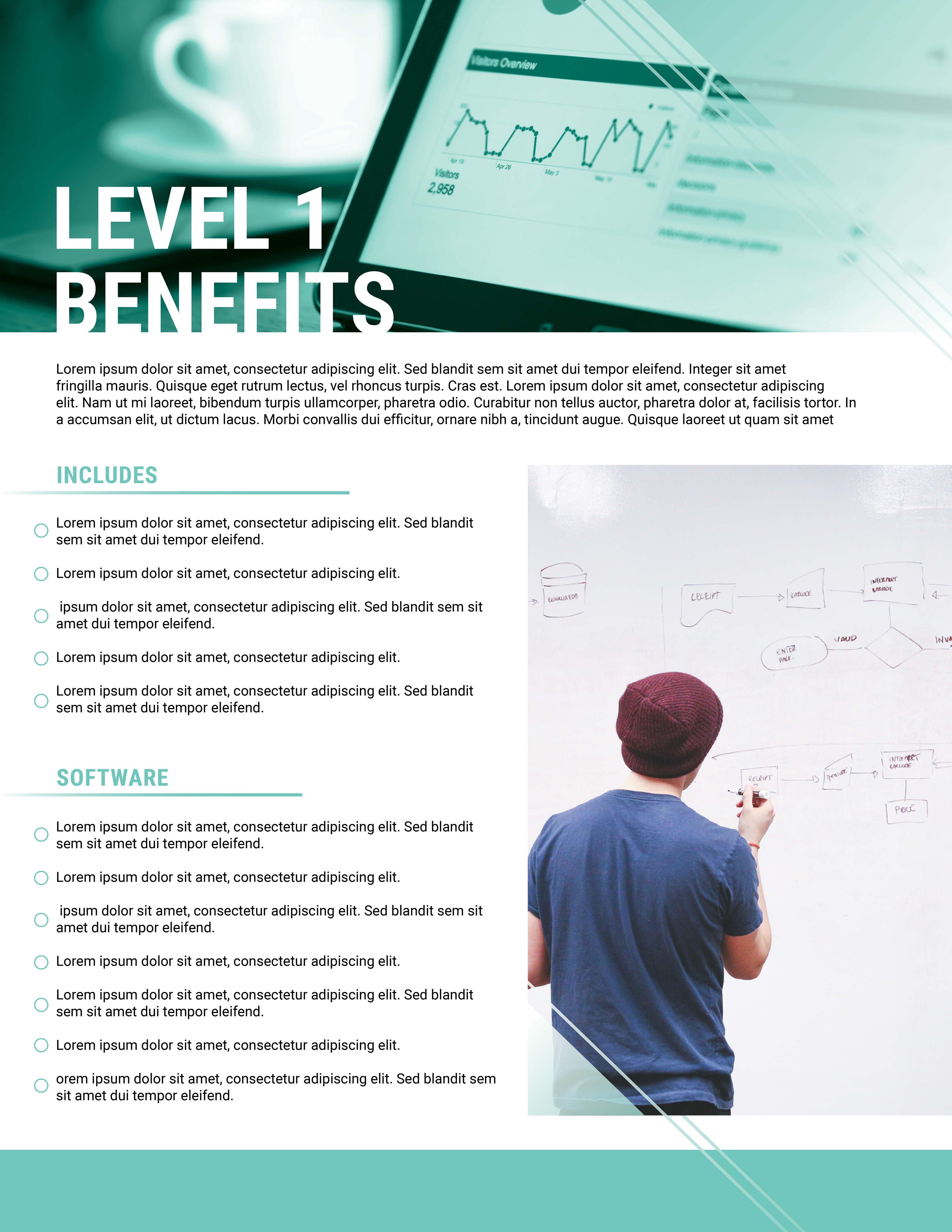

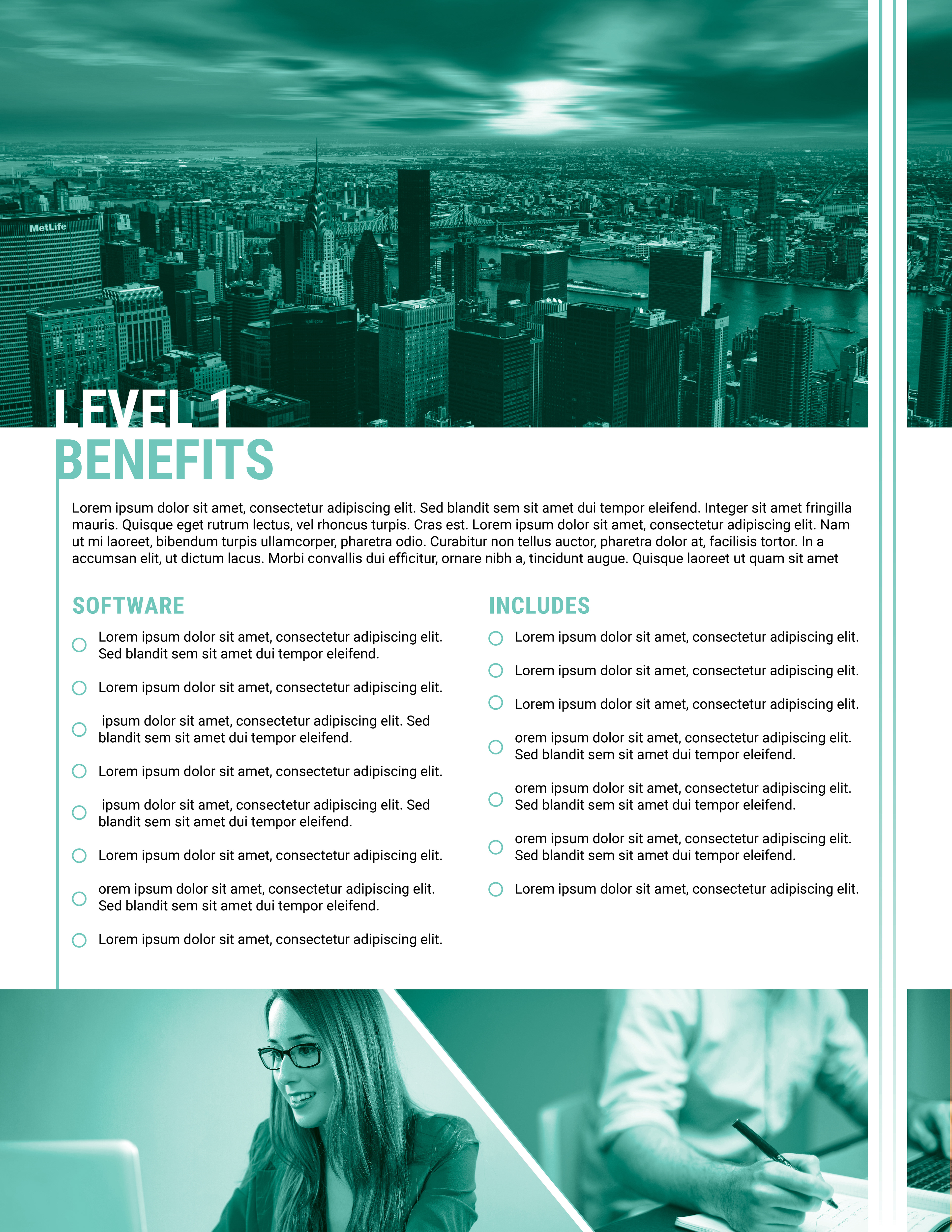
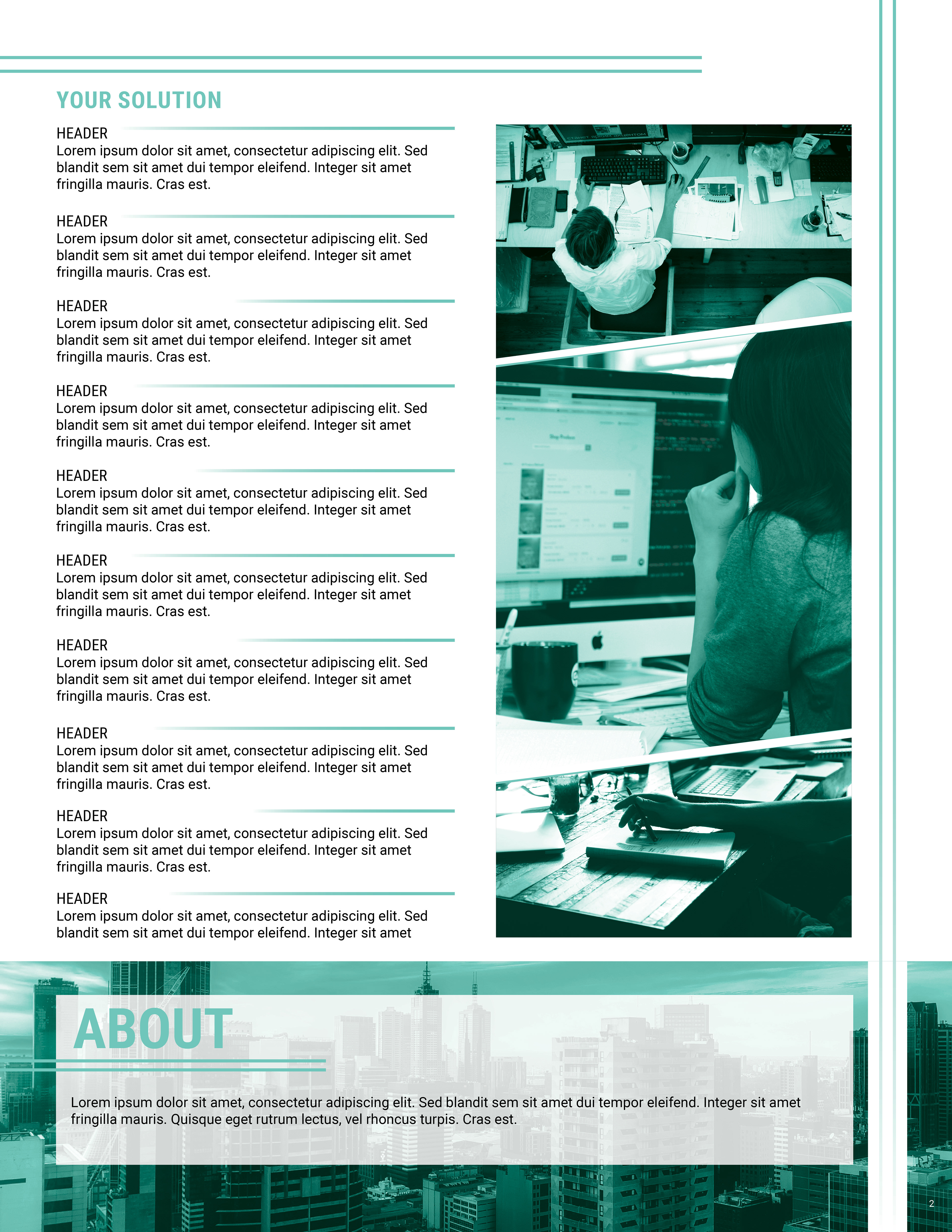
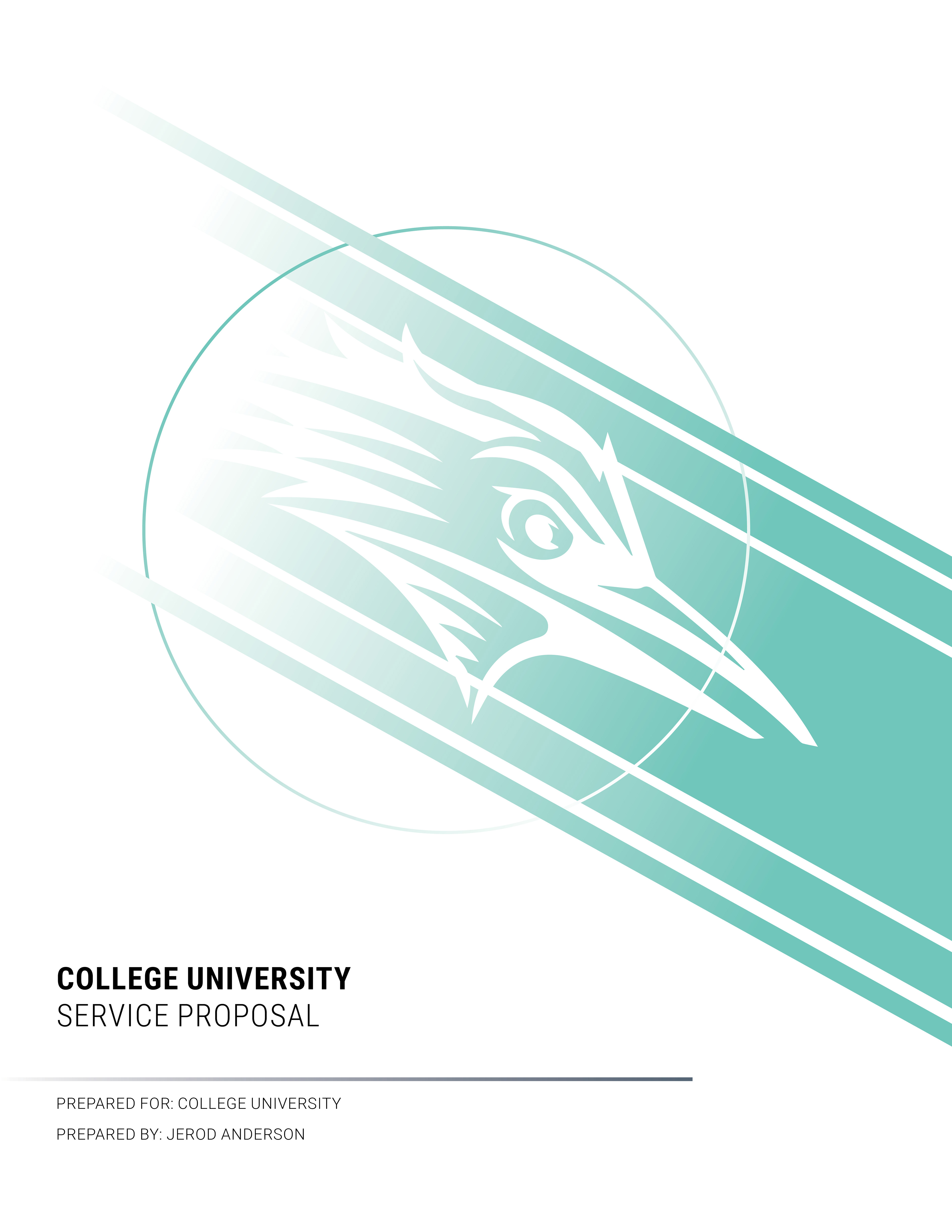


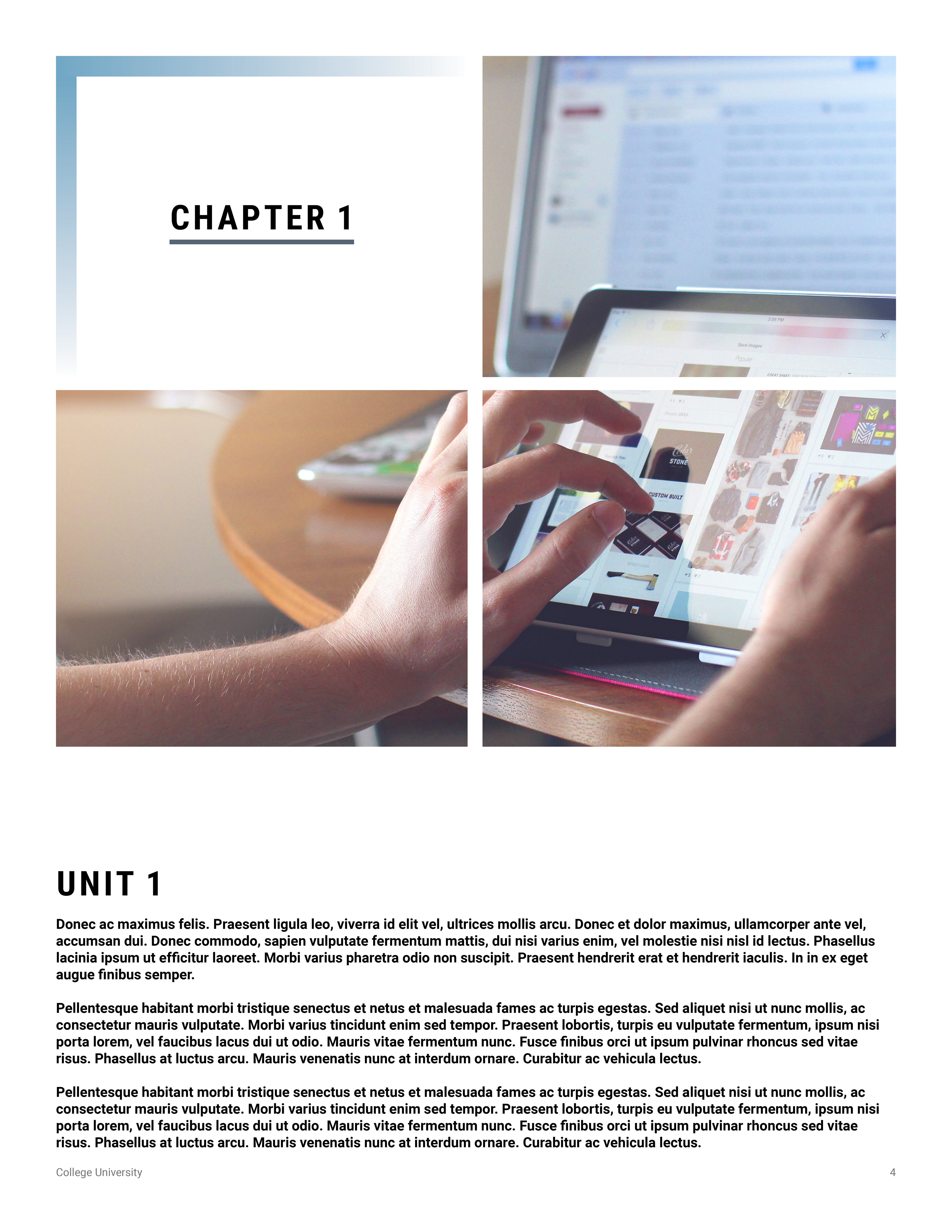
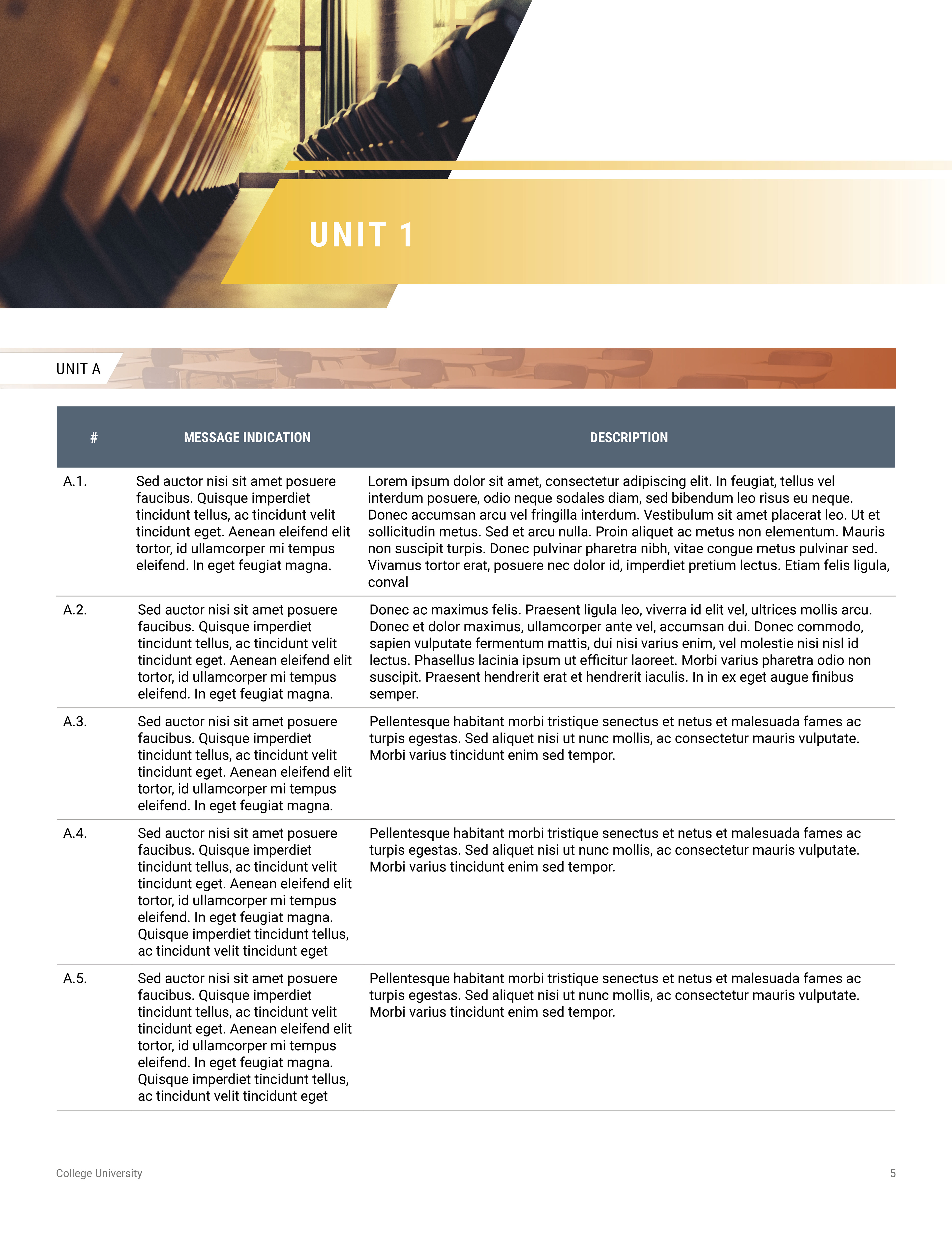
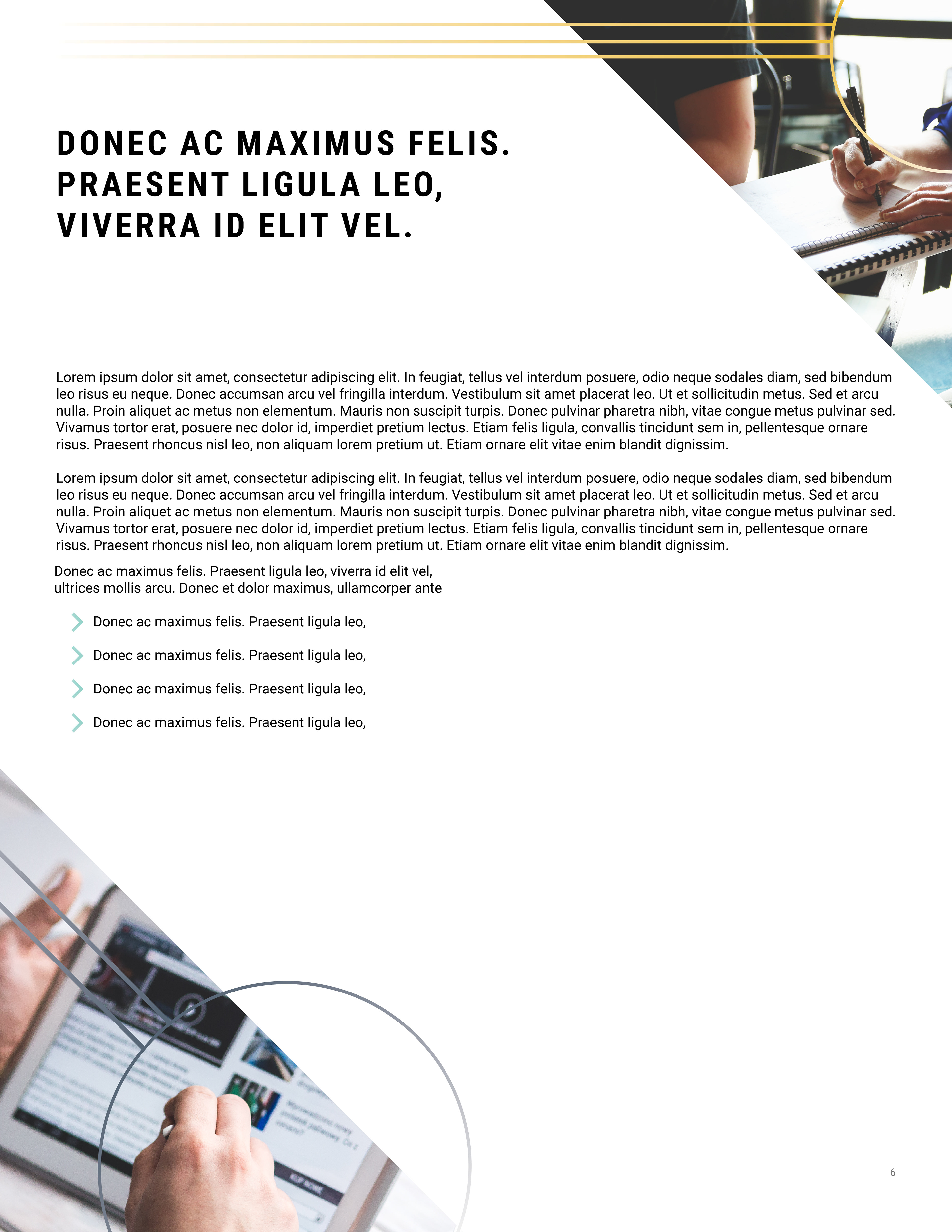

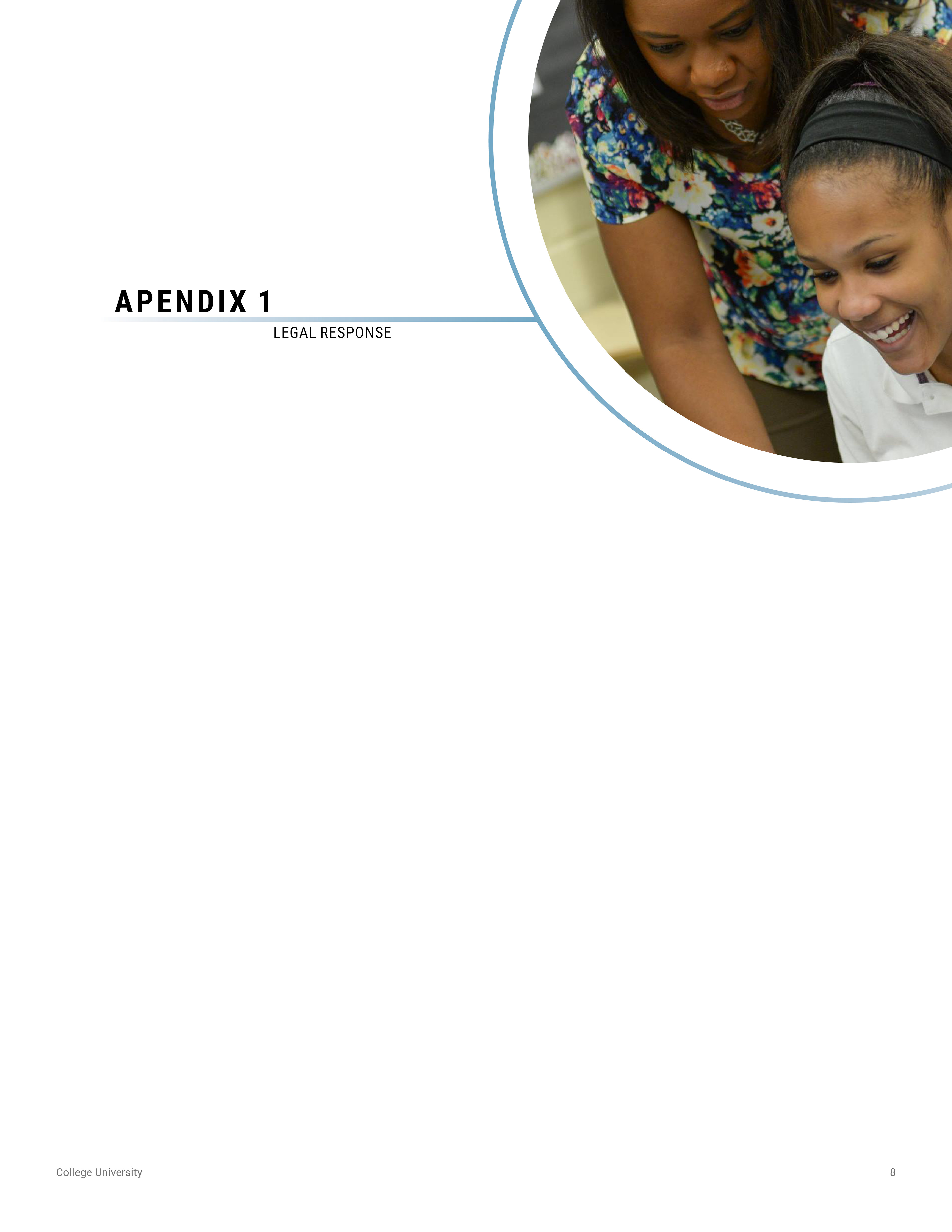
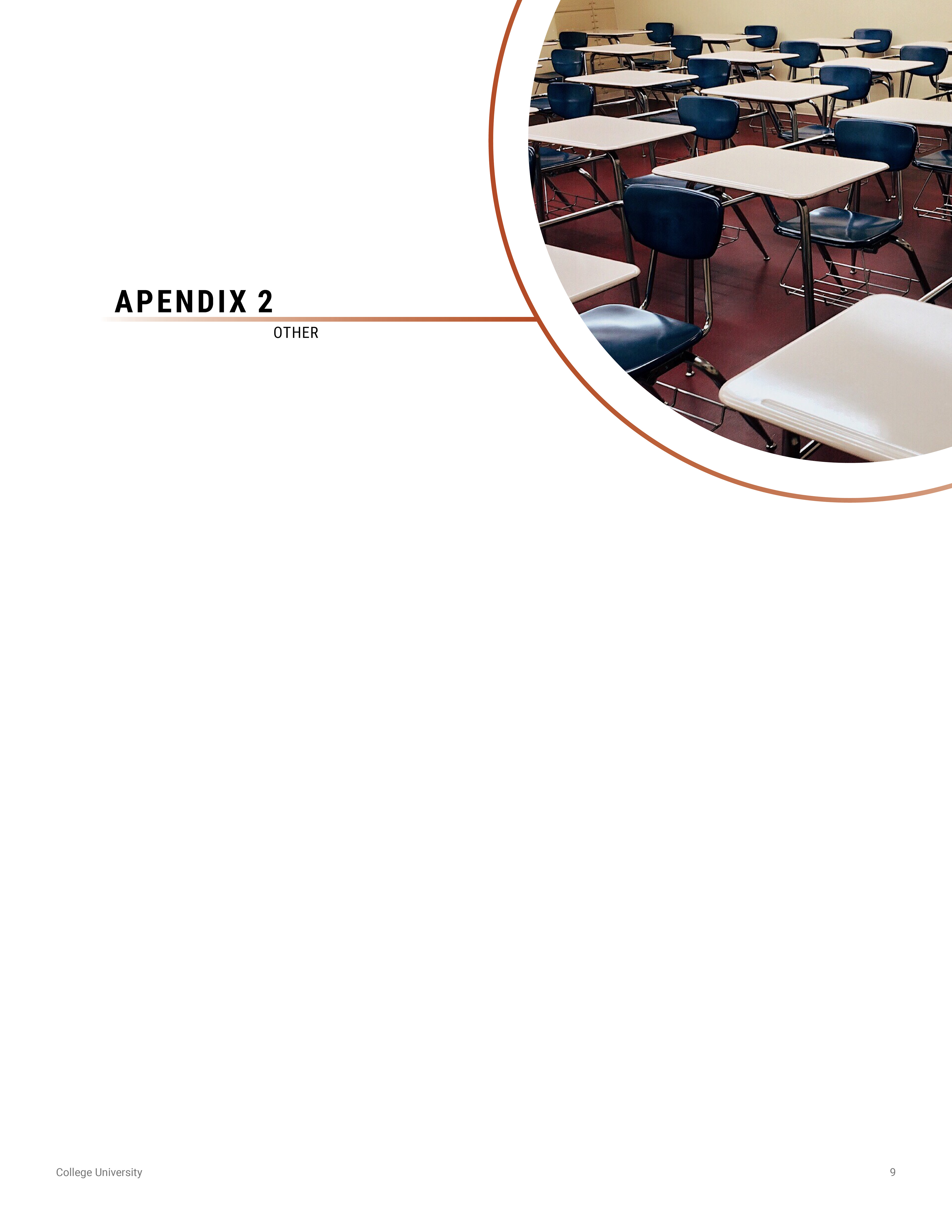
I worked on RFPs and other proposals during my time there. I needed to make them visually interesting because reading a plain boring document never grabs anyone's attention. For this one I had to focus on an RFP for a school (I did have to remove the actual school I was doing it for) but I wanted to interlace the document with images of classrooms and technology, while keeping the style clean and on brand.

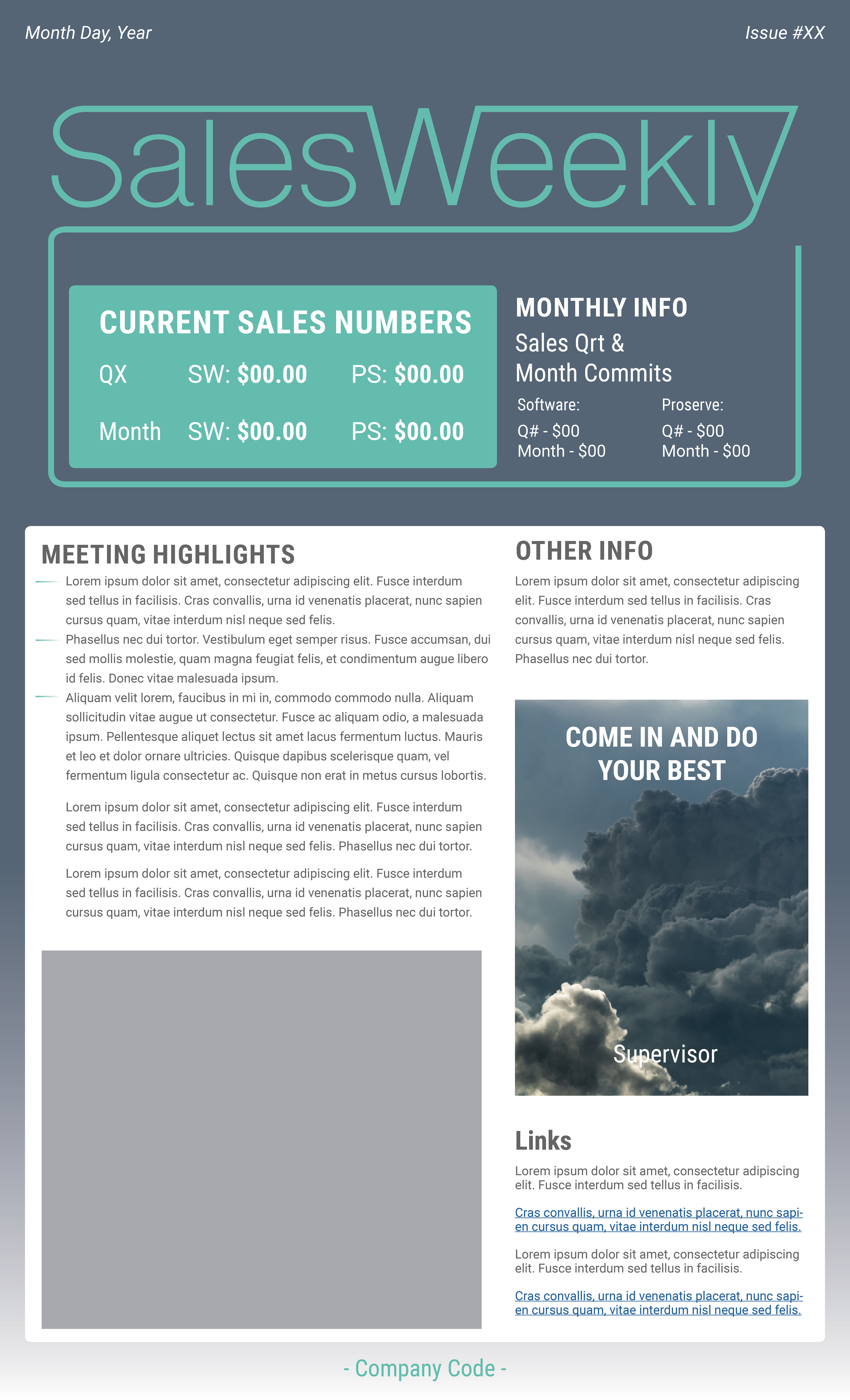

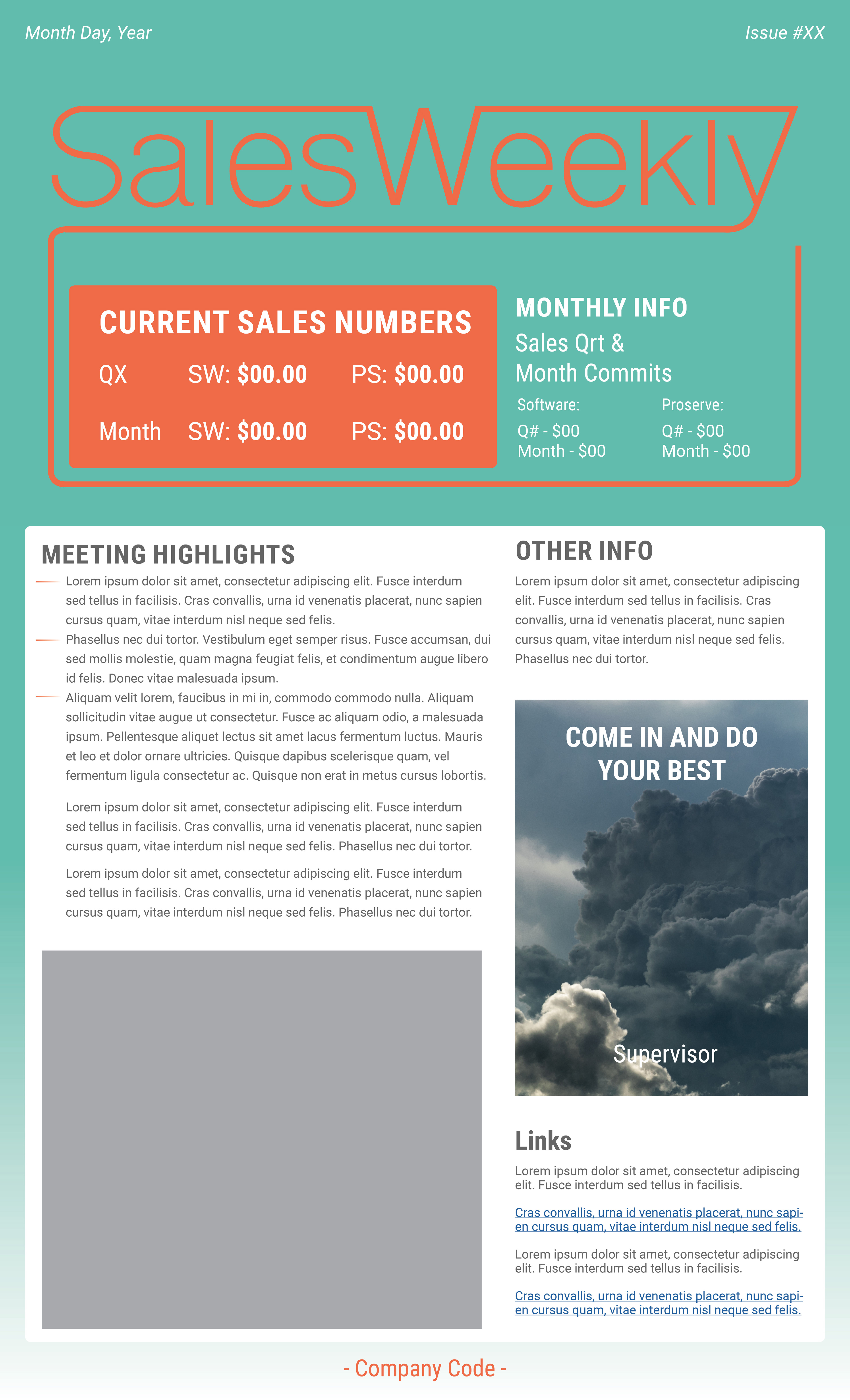
I was also given the task of re-creating the sales-floor weekly newsletter. I made it more open, friendly and gave the newsletter editor a bunch of colors to work with to change things up once in a while.
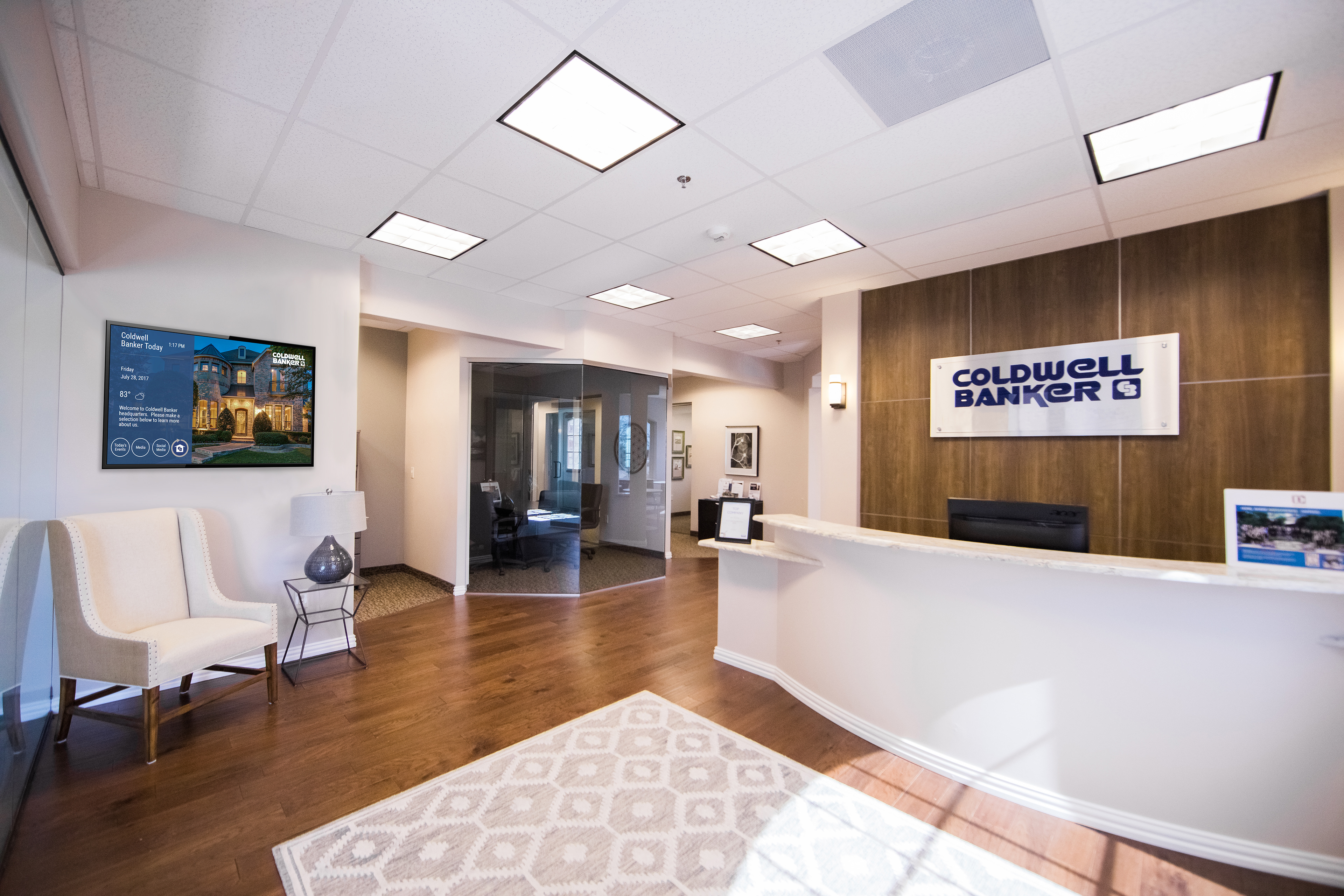
I also had to do some quick photoshop work to place monitors and screens in a client's environment.


